Tracking the Contemporary Romance Color of the Year


pink 2

Contemporary Romance Color of the Year with six swatches in green, peach, fuchsia, lavender, blue and yellow Every now and again I get finished copies of books, which is nifty, especially now that hard copies come with colorful treatments on the edges, or embossing and foil on the covers.

But I kept seeing this one book on my desk out of the corner of my eye and had to look again to remember which of the Fuchsia Pink Contemporaries it was. It kept giving me a double-take because there have been so many Fuchsia Pink Contemporaries!

Which got me thinking.

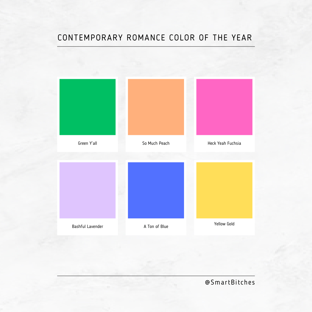
I think we need to declare a Contemporary Romance Color of the Year.

Pantone picks a color of the year, and there’s been mountains of research into how one color trend moves from industry to industry, like interiors and wall colors to automotive paint, for example. Color is an integral part of branding and iconography, and certainly some colors would lend themselves more to one genre over another.

There are now color schemes that I mentally associate entirely with one genre.

For example: if you are writing suspense, well, Suspense is Blue and Gold.

What have you done in yellow against a blue sky with a tiny red farmhouse at the bottom The House Across the Street by jill childs - a house with lit windows and a figure in the window against a cobalt blue sky with yellow lettering for the title

The widow of dwyer court by lisa kusel a lit window in gold of a house that's blue against a cobalt sky and again the title is in yellow my sister's boyfriend two figures silhouetted in yellow light in a blue tinged window with the title in yellow

the shaodws of hill manor a woman in a yellow raincoat goes up to a derelict house in blue against a blue gray sky and the title is yellow Irreplaceable by nolon king and lauren street a dark blue house in a storm against a blue sky with yellow lit windows and the title in again YELLow

the forever home a blue house with lightso n against a yellow and blue sky with the title in yellow no road home by john fram a blue front of a big estate house with yellow windows with the author name in yellow

See what I mean? This was only a sampling of all the Suspense is Blue and Gold cover designs I spotted.

I also noticed this trend, which doesn’t quite qualify as a single color, but is definitely a repeating motif, one which I’m calling Split Down the Middle: 

First Time Caller by BK Borison features a pink and peach illustration with a person with long hair and pink pants on one side, a line dividing the colors down the middle, and a person with short hair and a peach and yellow puffer jacket on the left side Ola Tundon's Endgame - half the cover is orange with a Black woman with her hair in a bun sitting on the floor with her back to a man whose side of the cover is entirely red with a dude with short hair and a beard sitting on the ground with books and a desk lamp

Back to Belfast by Emma McGeown features two people side by side on a couch one half of the cover is green with a red haired woman with a laptop and the otherside is dark blue night scene with a woman with long black hair and a black cat Two Doors Down Mary Hargreaves features a split cover down the middle with a woman in a pink room and a blue blouse on the left and a man in a grey shirt in a blue room on the right

Sarah Ready - Wished - half the cover is purple and half is ice blue and in the middle is a man in a purple shirt holding a woman in a blue shirt in his arms and their foreheads are together The Holiday Honeymoon Switch by Julia McKay - half of the cover is teal and half is purple, with two women leaning against trees. The woman on the left on the purple side is leaning aginst a pine tree and is wearing winter clothes including a red hat and a teal jacket. The woman on the teal side is wearing shorts and a red tank top and is holding a tropical drink while leaning against a palm tree. In the background are two men both dressed seasonally appropriate for the side they are on

This is not an office romance by eloise fox is half teal and half pink. on the teal side is a woman in a business suit with a skirt standing at a desk and on the pink side is a man in a dark suit near an office chair The Promise of Tomorrow by Samantha Tonge - half blue and half pink with a window split down the middle. on the left side of the window is a beach scene and on the right is a winter scene

Unrelated: it’s probably not a great thing that my brain loves patterns SO much because this is the result.

Also: I am not, like, REALLY not good at spotting AI covers. Like Katee Robert said in a podcast interview with me, it’s like trying to spot the fae and I’m very unskilled at it. So if you recognize one of these covers as AI, please know that I’m not trying to celebrate AI art or promote it or anything like that.

Patterns, though? I’m extremely good at spotting those, as you’ll see in the next few weeks. I’ve got quite a collection of covers sorted by color, and it is QUITE a competition for Contemporary Romance Color of the Year.

I’ll be posting collections of covers as entries in the competition in the coming weeks here and on social media (you can follow us on Facebook, Instagram, Xitter, and BluSky) and then we’ll vote on which one you think is THE Color of Contemporary Romance for 2024.

Can you guess what the leading color contenders are? What colors have you spotted most on Contemporary Romance? 


Source link

About The Author

Scroll to Top